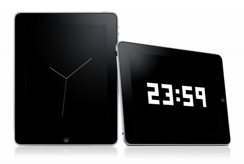
My clock apps for iPad are rejected: “Minimal User Functionality”.
I am Japanese, not an English speaker. Just studying so please be patient with my English.

I uploaded two free clock apps for the iPad. These apps simply shows clock and digital time.
But these were rejected by iPad review team. The reason is “Minimal User Functionality“.
I google it, realized that other developers are suffering.
http://www.crunchgear.com/2010/03/01/new-arbitrary-app-store-rejection-reason-minimum-user-functionality/
By the post above link, the email body from review team is completely same but app name.
Thank you for submitting rydigital for iPad and ryclock for iPad.
We have performed an initial review of your applications and determined that these applications contain minimal user functionality and will not be appropriate for the App Store.
If you would like to share it with friends and family, we recommend you review the Ad Hoc method on the Distribution tab of the iPhone Developer Portal for details on distributing these applications among a small group of people of your choosing or if you believe that you can add additional user functionality to rydigital for iPad and ryclock for iPad, we encourage you to do so and resubmit ……
My apps are not spam!
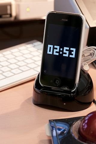
For my apps “ryclock” and “rydigital”, simple is the key and I don’t want to add unnecessarily function neither display design. And, iPhone versions are approved already…
I considered design and functions of these apps very well. Length of needles, move of the second hand, numeric fonts… Doesn’t telling the date is inconvenience? Of course I knew but I want is a perfect simple looks. Maybe it’s better if a user can customize colors. But I, as author, thinks it should be a black and white so it is. I don’t want to show the ugly “Setting” button. I think it’s important “Just run the app”, nothing else you have to do.
Of course some of users doesn’t agree with this, I know. Just I think it’s not Apple’s job deciding an app is useful or not. Users can handle it.
Ok, App Store is Apple area, then why we can’t create alternative? Apple disallows that. Apple allows nothing but playing in well-controled apple garden.
Go Google, Microsoft, other companies believing freedom!!
Create awesome tablets overwhelms iPad, and destroy the Apple empire!!
By the way, iPhone version of ryclock, rydigital and rycilinder are available on the AppStore for free. Please try it.

ryclock
http://itunes.apple.com/jp/app/ryclock/id334554784?mt=8
rydigital
http://itunes.apple.com/jp/app/rydigital/id335041000?mt=8
rycylinder
http://itunes.apple.com/jp/app/rycylinder/id344094983?mt=8


I think the Ryclock app for iPad is absolutely beautiful, it’s very sad it was rejected. Hontouni zannen desu ne… Is there any way you can send me a copy of the app? I’ll feature it on my site MONOmoda.com also. Yoku dekimashita.
Thank you finding ryclock !
Last week I put ryclock & rydigital on the review again. Coz I found very simple clock app like ryclock on AppStore. I know that the review policy changes often implicitly. I hope the policy was changed since I posted last time.
So, I’ll let you know if the review is finished. It’s taking a long this time… Please wait. Thanks.
Nice app! There is a simlar app which allows the user to change colours etc. I think yours is a better design. What Apple seem to be suggesting is for you to allow user options which I think you should as it will be a shame to miss out on such a nice app.